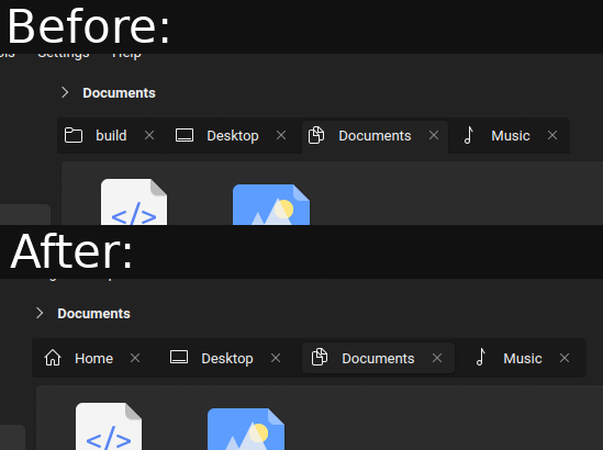
I think this is a big accessibility issue. Please let tabs be tabs. This design seems too similar to Firefox's new design where it's hard to tell which tab is active (specially if you have only two open). I feel like tabs should be attached to the viewport/content otherwise they look like buttons where my intuition is to click on an active to tab to activate it
KDE
KDE is an international technology team creating user-friendly free and open source software for desktop and portable computing. KDE’s software runs on GNU/Linux, BSD and other operating systems, including Windows.
Plasma 6 Bugs
If you encounter a bug, proceed to https://bugs.kde.org, check whether it has been reported.
If it hasn't, report it yourself.
PLEASE THINK CAREFULLY BEFORE POSTING HERE.
Developers do not look for reports on social media, so they will not see it and all it does is clutter up the feed.
I personally prefer this look. Reminds me of a task bar.
in what way is this an accessability issue, it just seems to be a minor visual stylization change?
Consider having just two of them. The one which is active actually seems like a button that demands attention. It's basic design stuff. Tabs denote choices between active viewports, it should be unambiguous always which one is active. These hovering tabs are more like buttons which intuitively ask to be clicked
https://github.com/black7375/Firefox-UI-Fix
Try looking at the comparison screenshots in this repo. Or look up some images of firefox australis. You'll see how tabs are actually behaving like tabs and are denoting clearly which one is active by linking itself naturally to the viewport
Edit: https://github.com/Glitchcode2447/Firefox-Australis-Theme
it seems more like a radio button describing where you are and where you can go, which is just slightly more abstract than tabs.
Because it works like that, but in the traditional way, not all corners are rounded, and there's no margin in the bottom.
No hating on you, but floating tabs really don't sit well with me, to the point I use CSS to revert them to regular tabs in Firefox lol
It seems like most people don't like it, especially on reddit, where they even seem to hate it.
It's like floating tabs in Firefox, which I still hate to the bone.
Why isn't this aligned?

Because the programming language I actually know is python, in c++ I'm currently barely above the „hello world”-level. It also annoys me, but at the moment I haven't yet figured a way out to align it properly, as soon as I do, I'll promise that I will align it
Looks great 👍
Thanks!
I like the before more. I would also like the color of the active tab to be the same as the area’s backgroud it’s connected to, like in Linux Mint’s default theme.
I still can't use it :( It compiles now, but when trying to set it all I get is this:
What distro do you have?
Gentoo
You should try installing these dependencies:
cmake extra-cmake-modules kdecoration qt5-declarative qt5-x11extras kcoreaddons kcmutils kcolorscheme kconfig kguiaddons kiconthemes kwindowsystem
I'm not familiar with gentoo's packaging system, so I can't tell you what command should you use, but if you find a way to install it properly, you can help the project by writing a segment to the readme about the installing of dependencies in gentoo
Lightly half works for me on Plasma 6 following instructions on the qt6 version on GitHub. The window decorations and Lightly-related aspects of the plasma theme work, but I can't apply the application style.
What os do you use?
KDE Neon
I now found a way to properly install it onto KDE neon, now a fully working guide is on the readme if you're still interested:
The best I can say is to try installing these as dependencies, because I'm starting to get lost in the ubuntu based distros different package sources
sudo apt install kf6-kcoreaddons-dev kf6-kcolorscheme-dev kf6-kguiaddons-dev kf6-kiconthemes-dev kf6-kconfig-dev kf6-ki18n-dev kf6-kwindowsystem-dev kf6-kirigami-dev kf6-kcmutils-dev
Love it, you should probably rename your fork to something like lighter or idk bulb?
I was thinking about „darkly”, or something like „nightly”, but I like your „bulb” idea, it's funny
Looks amazing! But the tab could be connected to the page, I agree
I like it!
Thanks!
I like new options. I'd suggest you change the name, though. I still have the regular lightly and I want to use this alongside it.
Could call the fork "nightly" lol
I was thinking about „darkly”, but that's a great one too
I just suggested "Slightly". >:)
I'll try renaming it, but it probably is a long process, until that, please help me choose a name
Slightly? Lol
That would represent my programming knowledge pretty great at the moment
yeah floating tabs are nice
Thanks!
