this post was submitted on 27 Jun 2023
7 points (100.0% liked)

Liftoff!

4352 readers
1 users here now

A mobile client for Lemmy running on iOS and Android

founded 1 year ago
MODERATORS
 

Hey everyone! We have been blown away by the response to Liftoff and we really appreciate the support of the community. We're passionate about creating an app that we want to use and we're excited with the progress. There have been a ton of updates and bugfixes this week and we wanted to share the latest state of things

v0.9.18 Release

iOS:

Android:

Changelog

  • Fixed issue where "Everything -> Subscribed" feed showed no posts
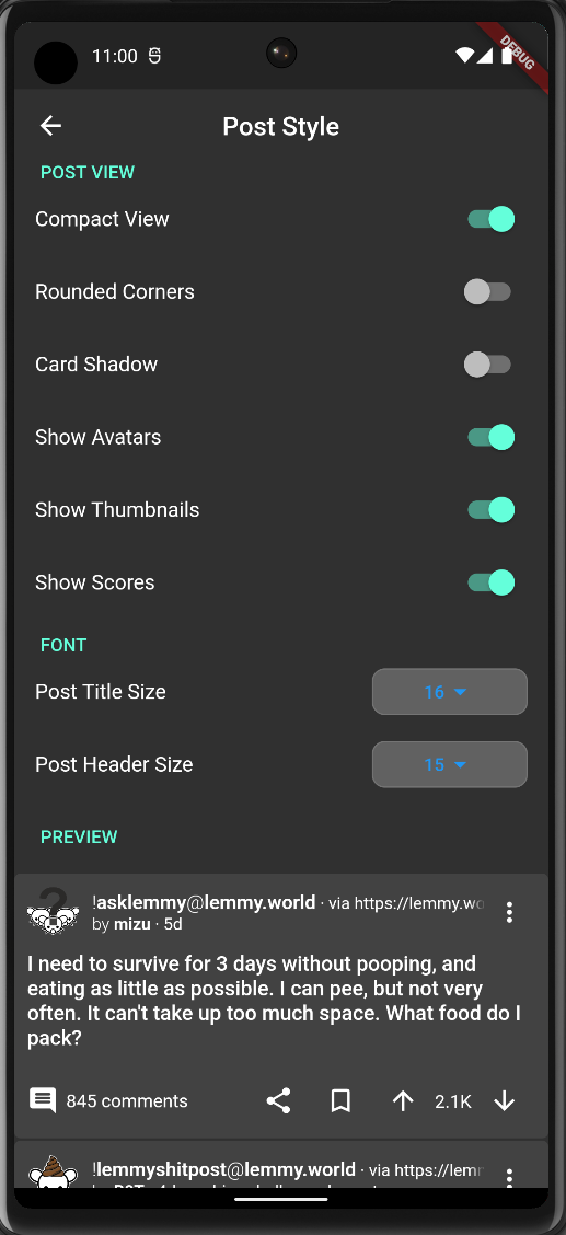
  • Added better compact view
  • Added Post Customization page in settings with live preview
  • Added ability to customize font size
  • Added ability to quickly toggle between card and compact view
  • Fixed mark as read not working, added mark all as read
  • Fixed issue with comment share link not being generated properly
  • Added Gesture Navigation (Thanks shocklateboy92!)
  • Added TOTP Login support (Thanks swmarks!)
  • Added animation configuration (Thanks johnc86!)

Known Issues (In progress)

There are a few bugs still that we're working through and we really appreciate all the support from the community helping us Beta test. Here are some of the known issues we're working on:

  • User and community link opening within the app is finicky #107
  • Separate default comment sort from default post sort
  • New sort in community page's posts sometimes not working properly
  • Unclear usage of everything feed causing seemingly duplicated posts across the difference instances.
  • Check here for a full list

Screenshots

top 2 comments
sorted by: hot top controversial new old
[โ€“] [email protected] 1 points 1 year ago

Hiya, thanks for the app, my favourite so far! One QOL I'd like to suggest is a left-handed card view, where the image or content is displayed on the left side of the card instead of the right. So my fellow left-handed friends can navigate a lil' easier. Thanks!

[โ€“] [email protected] -1 points 1 year ago* (last edited 1 year ago)

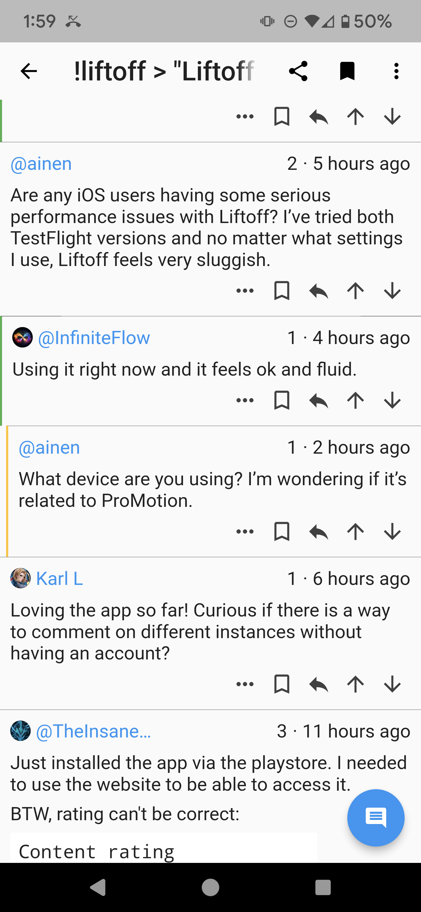
Can you do something about the size of the reply graphics? I'm talking about the green, orange, etc line that appears next to a comment when it is a reply. They're so narrow and the green one starts at the edge of the screen, making it almost invisible.
Example