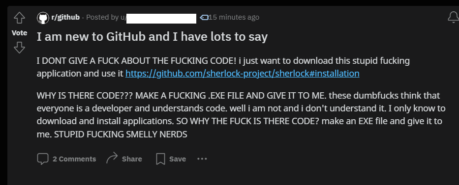
this post was submitted on 20 Feb 2024
1247 points (98.4% liked)
Programmer Humor
19452 readers
131 users here now
Welcome to Programmer Humor!
This is a place where you can post jokes, memes, humor, etc. related to programming!
For sharing awful code theres also Programming Horror.
Rules
- Keep content in english
- No advertisements
- Posts must be related to programming or programmer topics
founded 1 year ago
MODERATORS
you are viewing a single comment's thread
view the rest of the comments
view the rest of the comments

TBF, they could probably make the "releases" page more prominent rather than having it buried in all the "code" stuff.
GitHub has bad UX for people who just wanna download and use the programs
GitHub has bad UX for a lot of things
The Github UX is amazing if you ever had to use gitlab or bitbucket
Comparing bad to bad doesn't make any of them better lol
I've gone nuts trying to download a single file from the git website on my first interactions with it (because somehow adding a download file button when you're viewing a file on the site is just too much to handle)
It's not black and white. I actually liked a few things better about bit buckets UI. It's been too long to remember specifics though I think it was concerning PRs and diffs. I still think GitHubs review UI is too complicated. It took me literally years to fully understand it.
i really enjoy the lack of dark mode and the way it doesn't work on a tablet
My bad. It indeed is black and white. There can be no redeeming aspect of bitbucket. Fair point
thank you! now was that so hard?
Sometimes I just need a reminder
It does actually have a dark mode now! Still not great otherwise.
I'm not so sure. I seem to be able to find my way around a GitLab project in much fewer moves than a GitHub project. But maybe I'm biased because I use it all the time at work. I know they change the sidebar a lot, though.
The worst part about Bitbucket is the horrible, godawful, practically useless search