325
Rule 84, etc
(lemmy.ml)
Be sure to follow the rule before you head out.
Rule: You must post before you leave.
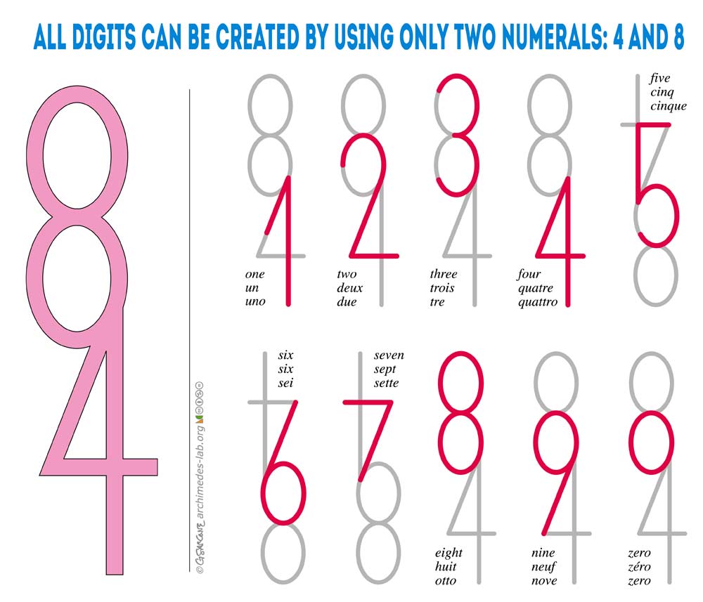
I argue that when presented with 9 normal looking numbers, the o is not an acceptable alternative to 0
So many fonts just do whatever to be different and stand out from the crowd, but all it does is making it easier to avoid them
It just looks like a lowercase 0. Lowercase digits often look better anyway.
what
Look up lowercase digits in your typography manual and be enlightened. And also start making nicer documents.