this post was submitted on 21 Nov 2024
566 points (86.6% liked)
linuxmemes
21378 readers
1230 users here now
Hint: :q!
Sister communities:
Community rules (click to expand)
1. Follow the site-wide rules
- Instance-wide TOS: https://legal.lemmy.world/tos/
- Lemmy code of conduct: https://join-lemmy.org/docs/code_of_conduct.html
2. Be civil
- Understand the difference between a joke and an insult.
- Do not harrass or attack members of the community for any reason.
- Leave remarks of "peasantry" to the PCMR community. If you dislike an OS/service/application, attack the thing you dislike, not the individuals who use it. Some people may not have a choice.
- Bigotry will not be tolerated.
- These rules are somewhat loosened when the subject is a public figure. Still, do not attack their person or incite harrassment.
3. Post Linux-related content
- Including Unix and BSD.
- Non-Linux content is acceptable as long as it makes a reference to Linux. For example, the poorly made mockery of
sudoin Windows. - No porn. Even if you watch it on a Linux machine.
4. No recent reposts
- Everybody uses Arch btw, can't quit Vim, and wants to interject for a moment. You can stop now.
Please report posts and comments that break these rules!
Important: never execute code or follow advice that you don't understand or can't verify, especially here. The word of the day is credibility. This is a meme community -- even the most helpful comments might just be shitposts that can damage your system. Be aware, be smart, don't fork-bomb your computer.
founded 1 year ago
MODERATORS
you are viewing a single comment's thread
view the rest of the comments
view the rest of the comments

So many people say that but I actually liked the menu. It opened very fast and you could far more quickly find and hit the right tile than that stupid nested programs tree that was the norm in the start menus of earlier Windows versions.
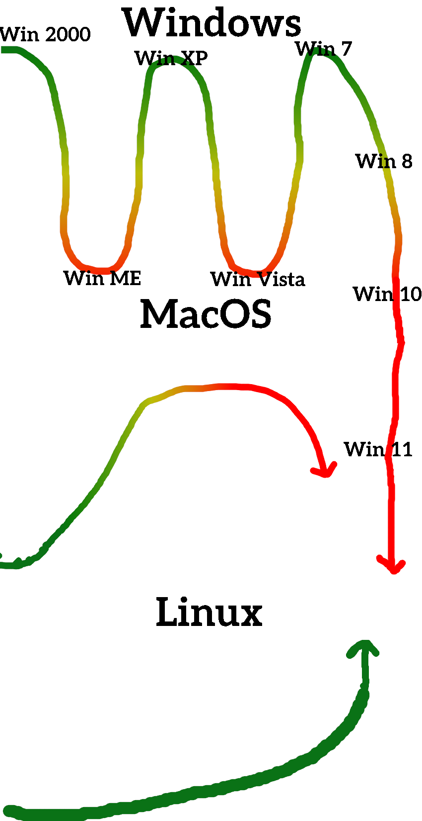
I'd say considering that telemetry started to creep in primarily with Win 10, 8 was indeed better (meaning less bad).
Personally, I felt like Win8 was an over correction in favor of touch screens vs Win7. Win8.1 was kind of the sweet spot for getting touch screen functionality into Windows while maintaining a consistent UI between tablets, laptops, and desktops. So much so that I would consider it to be separate point on the chart between 8 and 10.
Win10 did improve the UI a bit over that, but was so much of a step backwards in basically every other regard that I do consider that the point at which Windows started trending consistently downwards. As in, Win10 should be lower then Win7 on that curve, with Win11 lower than that, and no real hope that any future updates or versions will ever improve anything.